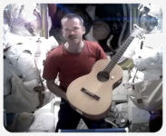
 Last night’s Soyuz launch to the ISS with Karen Nyberg, Luca Parmitano and Fyodor Yurchikhin has made a new record, taking only 5 hours and 39 minutes from rocket ignition to the station. It was only the second time the faster launch method has been tried with astronauts on board, but it was a full success and the three new crewmembers did not have to endure nearly two days in the cramped Soyuz spacecraft like before. Now the ISS is again fully crewed with six people – the two NASA astronauts Karen Nyberg and Chris Cassidy, ESA astronaut Luca Parmitano and the three russian cosmonauts Pavel Vinogradov, Alexander Misurkin and Fyodor Yurchikhin.
The star, so to speak, of the ISS Expedition 36 is Volare, the fifth long-term ESA mission to the station with italian astronaut Luca Parmitano. He is one of the newest and youngest astronauts inhabiting the space station – the former italian airforce pilot had only been selected in 2009 for a group of astronauts called The Shenanigans and his mission is his very first space flight. Both Karen Nyberg and Fyodor Yurchikhin have been in space before, the russian cosmonaut was even part of a long-term ISS mission in 2010.
Here are some links to the videos from the launch, docking and crew welcome:
• The launch from last evening – there’s also the complete ESA coverage.
• Approach & docking – spectacular views of the Soyuz at the station!
• Hatch opening, welcome and press conference – a really warm and even funny welcome.
Apart from the “official” channels, there’s also the ESA blog of Luca Parmitano’s Volare mission, where he also often writes himself. He’s also on twitter as @Astro_Luca as is Karen Nyberg as @AstroKarenN, who has already written a short first tweet from space – and I’m sure that Luca Parmitano will follow soon.
It’s going to be very busy on the ISS soon, not only because of all the science experiments – the station is going to be a real spaceport with ESA’s ATV transporter Albert Einstein arriving on 15 June, the first flight of Orbital Sciences’ Cygnus 1 following later that month and the Japanese HTV-4 and a Russian Progress freighter coming in August. The next Dragon transporter from Space X will fly in December and there will also be a whole new station block, the Russian Nauka Multipurpose Laboratory Module added to the ISS at the end of the year.
 Last month, I was all excited because both Google and Opera had announced to work together on a new fork of the Webkit engine called Blink and I assumed that a new version of the Opera browser would be just like the old ones with the rendering engines switched out. Now Opera has released Opera Next 15, which is not exactly billed as a beta nor a preview, but as a kind of development version. It is the much anticipated first version of the desktop browser with the Blink engine, but unfortunately it turns out I was wrong with my assumptions because there isn’t much left from the previous versions.
[Update 3.6.: I now think that most of the worries expressed in this post are mostly unfounded… the first impression was simply wrong and based mainly on a misunderstanding that Opera Next 15 is a finished product. It is most definitively not and Opera has said in a posting today on Google+ that they are working on re-integrating many of the popular features. They also said that simply switching from Presto to Blink was impossible, because the user interface is too tightly interwoven with the user interface. They’re actively working on building up the new browser and they are listening to their users.]
But first the very good news: the Blink and V8 rendering engines are fast as blazes even on my old work notebook. I had been using Google Chrome for Google+ and Facebook in the last months because Opera’s old Presto engine was simply slower than Webkit in these cases. Opera Next 15 is still faster and seems to consume much less memory, making it a more streamlined and not so bulky version of Chrome – working with it on Google+, Facebook, Twitter and even in WordPress is very smooth compared to Opera 12. This is the one most impressive feature of Opera’s new version and there’s absolutely nothing to complain about the speed of the browser.
The bad news is that the user interface is actually just a clone of Chrome – there is absolutely nothing left from Opera 12. This has produced a huge backlash on the social media sites like the Google+ announcement and even on their own blog posting there is a lot of understandable anger. While this version is clearly labeled as a development build, removing everything that made Opera great before – the bookmark system, the sidebars, the high customizability, the download manager and many other things – is shocking to say the least. There isn’t even a proper bookmark system, the user interface is not customizable and the preferences are only a shadow of the previous version. I really hope that this release is really meant only as a demo for the new rendering engine, otherwise Opera will become totally redundant by just becoming Chrome with an Opera logo on it.
The problem here is that Opera is not very communicative about the new version – if they would have said that it is just a test version to show the engine, it would have been okay. But this version, while impressively fast and really usable as a browser itself, completely lacks the individuality of an Opera browser. I can see the need to build up a new user interface after all that time and the first steps are okay, but if this is an indicator of a finished product, Opera has got a huge problem. I hope that the developers will come to their senses and put all the great features of the previous versions back into Opera 15 – otherwise many people will have to stay with version 12 and just use 15 or even Chrome as a secondary browser.
I have actually switched from Google Chrome to Opera Next for some resource-intensive sites, but Opera 12 stays as my main browser until I can import my bookmarks into 15 and at least the most important features of the older versions are implemented again. I’m not giving up on Opera, but I’m a bit worried about the direction this could be heading.
There must be literally thousands of interpretations of Harold Arlen’s and Ted Koehler’s Stormy Weather out there and even the great Ella Fitzgerald has recorded the song several times. For this week’s Music Monday, here’s a wonderful version from 1975 – Ella without an orchestra, just brilliantly accompanied by jazz guitarist Joe Pass, with whom she had made a couple of albums in the 1970s.
Of course I totally forgot that today is Towel Day, the annual celebration of all things Douglas Adams and Hitchhiker’s Guide to the Galaxy. I usually put up some related reviews over on DVDLog, but I haven’t had a chance to translate the articles to English yet, so I’ll give it a pass this year. But because I like the radio series most of all Hitchhiker-incarnations, heres an amazing trailer for the stage version of the original cast! Bonus: another different trailer. Now there are some hoopy froods who know where their towels are!
 Last week, Google kicked its own social network Google+ at least five years into the future with a huge makeover – it didn’t please everyone and there are still some issues to be worked out, but overall it’s a great evolution of a social network which has always been far ahead of its competition. But there were two other huge updates in the mobile world this week: first Google updated the Google+ Android App and then Opera followed with the completely new version of Opera Mobile. Both are pretty substantial updates and show that the companies are not sleeping when it comes to porting their programs to Android – especially compared to some other tech giants, who can’t seem to get their act together. But these two are doing it right and are first and foremost listening to their users.
 Google+ version 4.0 is actually not such a huge update like the jump from 3.5 to 3.6, because this time Google has just implemented the changes from the new version of the website in the mobile app. The new layout introduced with 3.6 was actually the basis for the website redesign, so there are no huge surprises here other than the integration of hashtags and trending topics into the stream. But there have been some huge improvements under the hood: rendering speed is now much better and while loading still sometimes takes a few seconds on low-end devices, there are no more problematic slowdowns. The biggest improvement is, however, the ability to access and manage the Google+ photo albums, which means that it is now possible to share photos that not only have been taken with the internal camera directly from a mobile device. Unfortunately it is not (yet?) possible to share images from the device’s sd-cards or even from an external server, which should really be implemented. Otherwise the new version now feels much more mature and makes working with Google+ on mobile devices very comfortable.
 Opera Mobile has been the best browser I’ve encountered so far on Android, but the user interface of version 12 was clunky and not really suited for larger tablets. When Opera had announced a while back to switch their mobile and desktop versions to Webkit, I was somewhat concerned about the performance on my low-end tablet, but the beta versions of Opera Mobile 14 with the Webkit engine had proven otherwise. I had already completely switched to the new version and gladly updated to the final – I was, however, a bit miffed when I discovered that not the beta 14 was upgraded, but my installation of the old version 12. Luckily, all the bookmarks were imported in a legacy folder in the Speed Dial system, so nothing was lost. I didn’t miss the old version in the least, especially when I discovered that the final release, which was updated once more on Thursday, had become even faster and more stable than the betas.
The user interface is extremely minimal and the final version has switched to a fullscreen mode in which the address-menu-bar scrolls off the top – exactly the feature I was waiting for! No bookmark system has been implemented, only the speed dial, history and a somewhat useless “discover” page with links and news are available. Opera has not yet managed to connect the new browser with its own Opera Link service, only providing a link to the web interface. Also, there is still no progress indicator, which makes the actually faster loading times seem longer. Unfortunately, Flash is no longer supported – but that was expected since Adobe also has ceased to support Flash on Android. If Opera fixes the user interface a bit and gets a real bookmark system going, Opera 14 for Android could become the best browser for the platform – it’s already 90% there and Opera has just said today that they’re listening to their users and are working on it.
[Update 28.05.: Opera has made the previous version 12.1.4 available again in the Play Store as Opera Mobile Classic. If you have upgraded to the new version, you are not able to bring the bookmarks and other settings back unless you have a backup of /data/data/com.opera.browser – if you have one, just install Opera Classic again, start it one time and copy the files to /data/data/com.opera.browser.classic to bring everything back.]
Today’s Music Monday choice is a followup to my first posting from three weeks ago: the amazing singer-songwriter Meri Amber from Australia has now made a wonderful video for her latest song Share My Time. It has reached the top of the charts of the music initiative website triple j unearthed this week, where she had originally debuted the song. There’s also an early unplugged version on Youtube from last year and she has performed the song live on two Google+ Hangouts recently, once even in a duet with her dad!
 So on Wednesday, Google made some changes on Google+. Okay, make that a LOT of changes… during the IO Conference a whole lot of updates were announced and to the amazement of many users, were rolled out almost immediately. But while the changes of the user interface of Google+ are drastic to say the least, the new layout is not altogether new – it’s basically the look of the mobile app adapted to the desktop. The multi-column layout is taking a little getting used to, but it actually works quite well. The reactions from the users range from excited to horrified, but the majority seems to like it – and I have to say, that apart from some small issues, I’m also in favour of the new design.
I loved the old user interface of Google+, but after using the Android app about half the time I was wondering how long the actually rather old-fashioned UI would last. A redesign was inevitable, and I think Google was quite successful with it – for a start, it does look like a completely original creation and now has left Facebook firmly behind. I was a bit concerned regarding the rendering speed since we don’t have very fast computers around here, but apart from the expected slight slowdown in Opera, Google+ now even works faster especially in Google Chrome. The user interface now doesn’t feel like a website anymore, but like a real program, especially when you run it in fullscreen. The new layout wastes a bit more screen real estate, but even on my small 1024×768 notebook screen it’s more than acceptable. Apart from the layout changes, Google has also changed the default font to Roboto, which is really easy on the eyes and now consistent with the Android system.
But there are still some problems to be ironed out. Some photographers have complained about the new photo album system and there have been reports that the photo upload is sometimes extremely slow. I’m not a heavy user of the photo albums since I only throw my images in the photos from posts bucket and use the gallery software on my own website, but some users have real issues with the new system, which disrupted their workflow so heavily that they refuse to post any more photos. There is also one grievance that has hit me: when I want to upload a photo – which works now with drag and drop – the posting box becomes so big that I have to scroll down to use the post-button. This only happens on my 1024×768 notebook screen, but it’s still a little bit of nuisance which could be easily fixed with some smaller margins in the post box. It may be possible to fix this with a modified CSS code, but I have not yet looked into a solution for this.
Overall, the new layout is an amazing evolution of Google+ and while the surprisingly fast changeover could have gone better and there are still some teething problems, there is no reason to believe that Google is going to ignore the users. More control over the look of the user interface would be good and there have been some rumours that this is exactly what Google is working on at the moment. The new incarnation of Google+ will surely be even more improved and there is no need to panic or to do a rage quit. After all, Google is offering us a completely free service and while this does not mean that the users are not allowed to complain, there have been a few (understandable) overreactions in the last few days.
Google+ Icon comes from Dryicons.com – much better than the official ones :-).
 On Monday, three astronauts, Chris Hadfield, Tom Marshburn and Roman Romanenko returned from their half-year-stay on the International Space Station. While two of them were and still are Twitter users, it was especially Canadian Chris Hadfield who had really made internet history by not only sending daily images of earth from space, but also engaging in active social media outreach by filming videos, making music and giving lots and lots of interviews. His farewell gift from orbit, a wonderful cover version of David Bowie’s Space Oddity, has accumulated over 13 million views on the original Youtube video alone. What is even more amazing about his work is that he did it not as part of an orchestrated media campaign, but in his free time mostly all by himself and with the help of his son Evan.
It took a Canadian astronaut aboard the International Space Station to bring human spaceflight back into public awareness – not because he was told to, but because it was his personal choice. Chris Hadfield had actually been up in space two times before – in 1995 he flew with STS-74 to the russian space station Mir and six years later in 2001 he was part of the STS-100 mission to the new ISS, performing two spacewalks with his NASA colleague Scott Parazynski to install the Canadarm2 on the station. He was the first Canadian astronaut to walk in space – but these missions were only eight and eleven days long. His next spaceflight to his long-duration mission on the ISS came more than ten years later and gave him the opportunity to do what had not been possible before on his earlier missions due to time constraints – to share his incredible experience with the world. It’s fortunate that his time in space coincided with the emergence of social media, only five years ago all his efforts may not have been possible in this way.
Since the one half of Expedition 35 has come back to earth, there has been virtual radio silence to the public from the ISS. No more Twitter, Facebook or Google+ postings, no direct words from the astronauts themselves apart from a recent hangout with the actors of the new Star Trek movie. So why isn’t NASA stepping up to continue the wonderful outreach work of Chris Hadfield? There was a short artice in the Washington Post yesterday about this question and the answer was not altogether surprising: the NASA astronauts might not be allowed the same freedom Chris Hadfield has at the Canadian Space Agency, or at least they’re afraid that their activities in their free time might be seen as a misuse of government funds. With the sequester going on in Washington and NASA putting most of its education and outreach activities on the shelf, it’s completely understandable that most NASA personnel, maybe even including the astronauts themselves are not in a position to do much at the moment… but it’s a sad situation nevertheless.
But there is hope: both Karen L. Nyberg and Luca Parmitano, who are launching to the ISS on May 28th are active Twitter users and even now are busy tweeting about the launch preparations. And Chris Hadfield has also not gone silent after the landing – he is still reporting about his recovery process on earth and yesterday mentioned that he still has thousands of unreleased photos left which he is going to share daily. The adventure is still continuing…!
Later today, a group of three astronauts returns from the International Space Station, among them the amazing multi-talented Chris Hadfield, who has shared his experience in space through tweets and posts with photography, video and even music for the last six months. As a goodbye present, last night a wonderful music video of David Bowie’s Space Oddity was posted on Youtube with Chris Hadfield on vocals and guitar – and with video entirely shot on the space station! I actually had chosen something completely different for Music Monday, but I simply can’t resist posting this even if it’s already all over the web by now. Words fail me how completely and utterly amazing this is – it’s like real-life science fiction!
[Update 14.05.: The spacemen are safely back on earth! The NASA already has a great video summary from hatch closure to landing up on Youtube. News articles are all over the place, so I think I don’t need to write a seperate article. I may post something about the importance of Chris Hadfield’s phenomenal outreach work later or in the next days, though.]
 On Monday, Pamela Gay and Fraser Cain recorded the 300th episode of Astronomy Cast – an amazing and wonderful achievement of bringing scientific knowledge to just about everbody. They have been producing the podcast since September 2006 and have covered about every imaginable topic remotely connected to astronomy, but thanks to the scientific universe not being constant, there are still lots of new things to talk about and many older topics to revisit. Also amazing is that Astronomy Cast has spawned into a video podcast since the beginning of 2012 and every episode is recorded as a live hangout before it gets edited into an audio podcast, allowing the listeners to watch how the show is being made.
At the moment, there are 293 audio podcasts available on the website while editing is catching up with the actually recorded episodes. In addition, the latest 55 episodes are also available as video podcasts with an additional half hour where Pamela Gay and Fraser Cain answer questions from comments on the web. Shows 245-247 are available in this playlist (created by me), 248-300 are in the official playlist. The hangouts of the live recording usually happen every Monday at 21:00 CET and the best method to be notified when a hangout is coming is to circle +Astronomy Cast and +CosmoQuest on Google+.
So, why is Astronomy Cast so interesting? It’s not a dry and academic lecture, but the way Pamela Gay and Fraser Cain explain science is also not dumbed down at all, just enough simplified to make everything understandable for non-scientists. Some basic knowledge is, of course. required, as is at least some curiosity about the general subject itself, but their casual and friendly style makes the podcast very approachable, easy to listen to and often even really fun and entertaining. The sheer amount of episodes in the archive may be intimidating for first-time listeners, but the great variety of themes allows for a wide choice and while there is no need to listen to every single episode, I would neverteless recommend it.
So, happy anniversary, Astronomy Cast! May there be at least 300 more episodes in the future – you’ve been and will be an invaluable source of knowledge. Celebrate by listening or watching an episode or two, circle them on Google+ and leave them a nice comment!